Alert Block: Primary
This is a custom alert block with a text link. It is styled by selecting Primary from the Type dropdown. The [.alert-link] class was added to the link.
Events by Category - Student - Three cards wide



Events by Category - Students - Four cards wide

Alert Block: None
This is a custom alert block with a text link. It uses the default None from the Type dropdown. The [.alert-link] class was added to the link.
Alert Block: Secondary
This is a custom alert block with a text link. It is styled by selecting Secondary from the Type dropdown. The [.alert-link] class was added to the link.
All Page Paragraph Bundles
All Paragraph Bundles
Take a deeper dive into how you can use each Paragraph Bundle in the Common Framework by looking at our extensive examples pages, which demonstrate all variations of each content type:
Accordion Set | Button Set and Text Block | Card Set (Cards) | Card Set (Icons) | File Form-link Table | Full-Width Image | Full-Width Video | Horizontal Navigation | Image and CTA | Image and Stat Block | Image and Text Block | Masonry Gallery | Quote | Slideshow | Tab Set | Text | Tile Set | Video and Text Block
Alert Block: Info
This is a custom alert block with a text link. It is styled by selecting Info from the Type dropdown. The [.alert-link] class was added to the link.
Basic Block: Explore What’s Possible
This full-width Basic custom block using Basic HTML provides space for prominent messaging, supporting information, and a clear call to action. Use this area to highlight important resources, services, programs, or announcements while keeping the content concise and easy to scan.
Whether you're looking for information, planning your next steps, or exploring available opportunities, you'll find resources designed to help you move forward.
Alert Block: Warning
This is a custom alert block with a text link. It is styled by selecting Warning from the Type dropdown. The [.alert-link] class was added to the link.


Alert Block: Success
This is a custom alert block with a text link. It is styled by selecting Success from the Type dropdown. The [.alert-link] class was added to the link.
Examples: Image Block

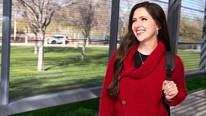
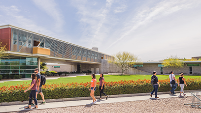
Image block image
Alert Block: Danger
This is a custom alert block with a text link. It is styled by selecting Danger from the Type dropdown. The [.alert-link] class was added to the link.
Events by Category - Students - Full width horizontal

Alert Block: Light
This is a custom alert block with a text link. It is styled by selecting Light from the Type dropdown. The [.alert-link] class was added to the link.
Alert Block: Dark
This is a custom alert block with a text link. It is styled by selecting Dark from the Type dropdown. The [.alert-link] class was added to the link.